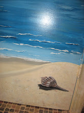
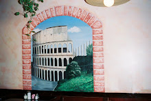
In the last 10 years, faux painting techniques have gone from obscure to popular, from the realm of professionals to do-it-yourself projects. These techniques are not difficult although they can be time consuming (what decorating or remodeling project isn't though) and require quick hands.
Called "faux" painting because these techniques mimic or create a false look of stone, texture, leather, and more, you will find that the styles fall into one of two types: additive or subtractive. Additive (also called positive) techniques simply mean that you add color onto the wall. Sponging is the most common of this type. Conversely, subtractive (also referred to as negative) techniques means you take paint off after it has been applied. Ragging is a common subtractive technique. Most negative techniques use glazes and require that you move quickly before the glaze dries.
When it comes to glazes, there are two types: latex (water based) or oil based. Latex is by far easier since it cleans up with soap and water, but oil based glazes provide longer working times and generally provide a harder, more durable finish. However, for do-it-yourselfers, I recommend latex glazes and working in small areas at a time. I have also seen solutions that you can add to the glaze to lengthen the working time. For your first glazing job, you may well want to consider using this additive available at finer paint supply stores.
Here are the various type of faux painting techniques:
Sponging: Probably the easiest method, you apply paint to a wall with a natural sea sponge. It provides a richly textured look. In addition to good looks, it's a simple way to camouflage an uneven or repaired crack wall. Use a couple of colors over the base paint to add greater depth. Be bold or subtle; it's up to you. You can use glaze or paint just as easily with this technique. I've seen this done in a negative manner, but it is most commonly performed as a positive method.
Ragging/Rag Rolling: Typically a negative technique, you paint a tinted glaze over the base painted walls. The glaze should be tinted darker than the base coat, keeping in the same color family as the glaze allows some color through it as well. Either use a wadded up dry rag or twist a rag into a cylinder. Then dab or roll the rags to remove the glaze. You can use one or two colors over the base coat. You may also do this in a positive method like sponging for a softer look and texture.
Color Washing: In this additive technique, you apply the tinted glaze mixture over the base coat using a circular motion as if you were washing the wall. Use rags for a very soft look or a natural sea sponge for a more textured appearance.
Strié: Create a historical and aged texture to the wall, with this negative method. Roll tinted glaze over the base coat, then use a wall paper brush to make fine lines from top to bottom. The glaze should be darker than the base coat to allow the lighter base to show through the fine lines.
Striping: The only difficult part of this positive technique is getting your stripes straight. Be sure to use a level or drop a plumb line. Tape off your stripes, then paint every other one with glaze. If you use a bold color, you do not need to tint the glaze to get a delightful two-tone effect. For softer colors, you may wish to slightly darken the glaze although it is not necessary. This technique may also be combined with color washing as you color wash the stripes for more interest and texture. Of course, for a more dramatic look, you can use paint in complementary or various colors.
Dry Brushing: This is a positive method in which you use a small amount of paint on a brush in herringbone patterns to create the texture. You will need tow or three colors to achieve the best results.
Frottage: Using plastic sheets for this negative method, tinted glaze is applied over the base coat and then plastic sheets are applied and smoothed over the glaze. Once the wall is done, the plastic sheets are removed for a marbling effect.
Faux finishes can provide interest and texture to your rooms - and less expensively than wall paper. While you may need to block out a full day to do the work, by the end of the day, you can sit back and admire the rich, luxurious look of your new room.
About Author:
Julie Lohmeier is the veteran of numerous home remodeling and building projects and has seen the entire spectrum of home improvement. She shares her remodeling tips, home decorating ideas, and other various rants at http://www.myhomeredux.com?FAUX_GO. @copyright 2005, Julie Lohmeier, www.myhomeredux.com
Article Source: http://www.articlesbase.com
Monday, March 3, 2008
Sunday, March 2, 2008
What Sheen Level of Paint Should I Use?
Explanation of paint sheen
Are you confused about which paint sheen level to use in which room, or which will be the most durable for your project? This guide will show you the advantages and disadvantages of paint sheen along with what sheen to use in which room.
Flat - A matte finish that provides a dead flat sheen.
Advantages
Excellent touch-up ability
Provides a dull, soft look
Hides imperfections
Disadvantages
Typically not washable, premium quality flat finishes may have washable characteristics
Eggshell (Velvet) - A very dull finish with a slight angular sheen.
Advantages
Low sheen, yet washable
Looks flat but has an angular sheen
Good touch-up qualities
Disadvantages
Not as washable as paints with higher shine
Satin - An enamel finish with a medium amount of shine.
Advantages
Very washable
Great for trim work and doors
Good for bathroom and utility rooms
Disadvantages
Poor touch-up
Magnifies imperfections on walls
Semi-gloss - A glossy finish used for high-traffic areas.
Advantages
Great wash-ability
Disadvantages
Poor touch-up
Magnifies imperfections more than satin on walls
Full Gloss - The shiniest paint sheen available. Used on products that need superior protection.
Advantages
Great for high-traffic areas
For use in schools, doctors offices
Can be used on floors and counter tops
Disadvantages
Very shiny, not intended for walls
Sheen by room (walls)
Kitchen - Satin or semi-gloss
Dining Room - Flat or eggshell
Bathroom - Satin or semi-gloss
Bedrooms - Flat or eggshell
Hallway - Flat
Basement - Flat or waterproofing paint
Ceilings - Flat
Trim work & doors - Satin
 WallDreams Paint Ideas!
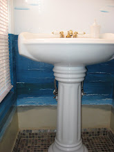
In faux painting techniques, a suggestion is to use a combination of sheens such as stripes of varying sizes and/or flat and satin finishes. Or perhaps a flat wall color with a gloss stencil or stamp.
Many faux painters do not use flat at all - to the extent that it is a faux pas to even mention the word!
When painting murals or many of the faux painting techniques, it is far easier to apply paints to a satin finish base coat than a flat finish that will absorb the paints being used. A satin, eggshell or semi-gloss allows you to push the glaze around as you need to, giving you a bit more time to finesse the technique being applied.
The great news is that your better paint stores now have developed some flat paints that are more washable and durable as well as suitable for some of the faux techniques that you might master.
Are you confused about which paint sheen level to use in which room, or which will be the most durable for your project? This guide will show you the advantages and disadvantages of paint sheen along with what sheen to use in which room.
Flat - A matte finish that provides a dead flat sheen.
Advantages
Excellent touch-up ability
Provides a dull, soft look
Hides imperfections
Disadvantages
Typically not washable, premium quality flat finishes may have washable characteristics
Eggshell (Velvet) - A very dull finish with a slight angular sheen.
Advantages
Low sheen, yet washable
Looks flat but has an angular sheen
Good touch-up qualities
Disadvantages
Not as washable as paints with higher shine
Satin - An enamel finish with a medium amount of shine.
Advantages
Very washable
Great for trim work and doors
Good for bathroom and utility rooms
Disadvantages
Poor touch-up
Magnifies imperfections on walls
Semi-gloss - A glossy finish used for high-traffic areas.
Advantages
Great wash-ability
Disadvantages
Poor touch-up
Magnifies imperfections more than satin on walls
Full Gloss - The shiniest paint sheen available. Used on products that need superior protection.
Advantages
Great for high-traffic areas
For use in schools, doctors offices
Can be used on floors and counter tops
Disadvantages
Very shiny, not intended for walls
Sheen by room (walls)
Kitchen - Satin or semi-gloss
Dining Room - Flat or eggshell
Bathroom - Satin or semi-gloss
Bedrooms - Flat or eggshell
Hallway - Flat
Basement - Flat or waterproofing paint
Ceilings - Flat
Trim work & doors - Satin
About Author:
Mike R. Smith - Check out http://www.how2instructions.com/ for more How-To articles.
Article Source: http://EzineArticles.com/?expert=Mike_R_Smith
Article Source: http://EzineArticles.com/?expert=Mike_R_Smith
In Addition:
All paint sheens are available for interior and exterior usage. Generally for exteriors, satin is more commonly used as it is better at repelling water and dirt.
Each manufacturer may have a slightly different translation of sheen, so do check their sheen levels before making a final decision on which to use. Satin, eggshell, pearl, low-luster and matte are additional terms used to describe sheen levels.
Color will have a variation on appearance according to the sheen selected. A higher gloss deep color may be more intense.
Flat paint has better stickiness to the surface while semi-gloss and gloss might have less adherance. Allow for addition amounts of high-luster finishes because of the addition coats needed as opposed to a flat finish.
 WallDreams Paint Ideas!
In faux painting techniques, a suggestion is to use a combination of sheens such as stripes of varying sizes and/or flat and satin finishes. Or perhaps a flat wall color with a gloss stencil or stamp.
Many faux painters do not use flat at all - to the extent that it is a faux pas to even mention the word!
When painting murals or many of the faux painting techniques, it is far easier to apply paints to a satin finish base coat than a flat finish that will absorb the paints being used. A satin, eggshell or semi-gloss allows you to push the glaze around as you need to, giving you a bit more time to finesse the technique being applied.
The great news is that your better paint stores now have developed some flat paints that are more washable and durable as well as suitable for some of the faux techniques that you might master.
Saturday, March 1, 2008
Paint Swatches - The Secret To Successful Decorating!
Paint swatches are your best friend when it comes to choosing paint colors to decorate the walls, furniture and other items within your home. A paint swatch has been designed to show you the many shade possibilities you have if your focus is on one particular color.
For instance, if you wish to paint your room blue, possible shades that await you include: azure, cerulean, periwinkle, denim, navy blue, cobalt blue, sapphire, ultramarine, light blue, indigo and hundreds of other hues.
Something else you will notice when looking at blue paint swatches, for example, is that you can choose blue hues that feature tones of green, purple and gray. Therefore, you have plenty to consider when you go color hunting.
The only problem is, with so much to choose from, finding the right shade can be both a difficult and tedious task.
To help you narrow down your decision making when it comes time to stare at the wall of paint swatches at your local paint or home improvement store, the following are some helpful interior painting tips you can keep in mind:
Warm or Cool – Think of the room you will be painting. Is it an area where you do most of your relaxing, entertaining or eating? For instance, if you are painting your bedroom it’s a good idea to choose a cool color such as blue or green that encourages relaxation.
On the other hand, if you are painting a kitchen or dining room you may want to use a warm red or orange to help increase appetite and conversation. Warm colored paint swatches include red, yellow and orange, while cool colors are blue, green and purple.
Light - Medium -Dark – Once you select the main color, you need to decide if you would rather a light, medium or dark shade. Light shades are a good choice for rooms that are small such as bathrooms, or for rooms that have few or no windows. Light colors also create a more subdued look.
Medium tones provide a more dramatic look and are a better choice for kitchens and large open spaces such as the family room.
Dark tones are not typically used for walls and are more commonly used for painting room accents such as furniture, trim or cabinets. However, dark walls may be desirable in bedrooms or to compliment a theme.
When looking at paint swatches you will notice that the colors featured on each swatch move from dark to light. Notice how different the darkest shade is to the lightest. Depending on if you use the dark or light shade will create an entirely different affect on the room you are painting.
Theme – Do you have a theme that requires certain colors? For instance, if you are doing a country theme, light yellow and blue are ideal choices. On the other hand, a Mexican theme would require spicier colors such as cinnamon and terracotta. This is something else you need to keep in mind when looking at paint swatches.
Neutrals – One of the biggest problems with adding color to walls is the color you choose may limit your ability to keep a space versatile. In other words, it is more likely for you to grow tired of a room that has a defined color on the walls than one with a neutral shade. There are plenty of neutral swatches you can consider.
The more specific you are with your color preference the easier time you will have selecting helpful paint swatches.
About Author:
Micheal Holland is the creator of home-decorating-made-easy.com. Visit his site for more great information about interior paint colors
Article Source: http://www.isnare.com/
WallDreams Paint Ideas!
Keep In Mind:
Colors you see online (images), in magazines or books (photographs) do not translate to the true color that you see, though they are great for inspiration.
Keep a sample paint card of your chosen colors with you at all times. You never know when you might need to match something up when you are shopping!
Live with a sample board with your chosen color for a few days before committing to the entire wall. This helps you see how the color looks in different lighting throughout the day.
Manufacturer's Paint Fan Deck - A sample of all the paint color's by that paint distributor that is organized and indexed from lightest to darkest for easy reference.
See Also:
Benjamin Moore's Virtual Fan Deck
Christopher Lowell's Choosing Perfect Paint Color
For instance, if you wish to paint your room blue, possible shades that await you include: azure, cerulean, periwinkle, denim, navy blue, cobalt blue, sapphire, ultramarine, light blue, indigo and hundreds of other hues.
Something else you will notice when looking at blue paint swatches, for example, is that you can choose blue hues that feature tones of green, purple and gray. Therefore, you have plenty to consider when you go color hunting.
The only problem is, with so much to choose from, finding the right shade can be both a difficult and tedious task.
To help you narrow down your decision making when it comes time to stare at the wall of paint swatches at your local paint or home improvement store, the following are some helpful interior painting tips you can keep in mind:
Warm or Cool – Think of the room you will be painting. Is it an area where you do most of your relaxing, entertaining or eating? For instance, if you are painting your bedroom it’s a good idea to choose a cool color such as blue or green that encourages relaxation.
On the other hand, if you are painting a kitchen or dining room you may want to use a warm red or orange to help increase appetite and conversation. Warm colored paint swatches include red, yellow and orange, while cool colors are blue, green and purple.
Light - Medium -Dark – Once you select the main color, you need to decide if you would rather a light, medium or dark shade. Light shades are a good choice for rooms that are small such as bathrooms, or for rooms that have few or no windows. Light colors also create a more subdued look.
Medium tones provide a more dramatic look and are a better choice for kitchens and large open spaces such as the family room.
Dark tones are not typically used for walls and are more commonly used for painting room accents such as furniture, trim or cabinets. However, dark walls may be desirable in bedrooms or to compliment a theme.
When looking at paint swatches you will notice that the colors featured on each swatch move from dark to light. Notice how different the darkest shade is to the lightest. Depending on if you use the dark or light shade will create an entirely different affect on the room you are painting.
Theme – Do you have a theme that requires certain colors? For instance, if you are doing a country theme, light yellow and blue are ideal choices. On the other hand, a Mexican theme would require spicier colors such as cinnamon and terracotta. This is something else you need to keep in mind when looking at paint swatches.
Neutrals – One of the biggest problems with adding color to walls is the color you choose may limit your ability to keep a space versatile. In other words, it is more likely for you to grow tired of a room that has a defined color on the walls than one with a neutral shade. There are plenty of neutral swatches you can consider.
The more specific you are with your color preference the easier time you will have selecting helpful paint swatches.
About Author:
Micheal Holland is the creator of home-decorating-made-easy.com. Visit his site for more great information about interior paint colors
Article Source: http://www.isnare.com/
WallDreams Paint Ideas!Keep In Mind:
Colors you see online (images), in magazines or books (photographs) do not translate to the true color that you see, though they are great for inspiration.
Keep a sample paint card of your chosen colors with you at all times. You never know when you might need to match something up when you are shopping!
Live with a sample board with your chosen color for a few days before committing to the entire wall. This helps you see how the color looks in different lighting throughout the day.
Manufacturer's Paint Fan Deck - A sample of all the paint color's by that paint distributor that is organized and indexed from lightest to darkest for easy reference.
See Also:
Benjamin Moore's Virtual Fan Deck
Christopher Lowell's Choosing Perfect Paint Color
Subscribe to:
Posts (Atom)


