In response to customer demands, many paint companies have come up with shades of taupe. Behr paint, for example, has its White and Light Collection. This collection includes shades of taupe that go from Parisian Taupe, to Indulgent Mocha, to Pale Bamboo. Some shades have more brown in them, while others have more pink.
Glidden also produces various taupe colors and, like all paint companies, the colors have fantastic names like Meditative Moment and Bistro Beige. As descriptive as the names are, they may not help with your color choice. How can you find a shade that works for you?
Find the brightest spot in the store and look at a color swatch. Flourescent lighting changes colors, so take the chip outside and look at the color again. Bringing fabric and carpet swatches will also help you find the right shade. Buy a small can of paint and try it on a small section of wall. Since changing light changes the color, look at your sample paint job during the day, at dusk, and at night.
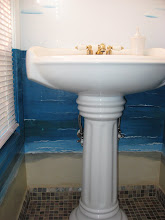
Your paint homework may not keep you from disappointment. The Home and Garden TV Web site has a message board and one home owner pleaded for help. He painted the walls of his renovated bathroom taupe and was dismayed with the result. "Every color I put up against the walls makes taupe come across as slightly mauve," he wrote. The home owner repainted the walls.
The Garden and Hearth Web site discusses taupe in an article titled, "Interior Design Colors: Taupe," by Sarah Van Arsdale. She describes taupe as a neutral color and a good choice for walls, but you have to choose the right taupe. "Be careful not to make a room too dark, " warns Van Arsdale.
A dark shade of taupe will make a small room appear smaller. Taupe also darken angular spaces. While taupe can be the basis of a neutral decorating scheme, Van Arsdale says you don't want your scheme to be bland. Adding textue with pillows and upholstery, plus colorful accessories, will keep this from happening.
Taupe is really a family of colors -- beautiful, rich, adaptive colors that go with all design styles. It's a great color choice if you're planning to move and a great color choice if you're planning to stay. With a little detective work you'll find the right taupe for you.
About Author:
Harriet Hodgson has been a freelance nonfiction writer for 29 years. She is a member of the Association of Healt Care Journalists and the Association for Death Educaiton and Counseling. Her 24th book, "Smiling Through Your Tears: Anticipating Grief," written with Lois Krahn, MD, is available from http://www.amazon.com You will find a review of the book on the American Hospice Foundation Web site and the Health Ministries Association Web site. Copyright 2008 by Harriet Hodgson
Log onto http://www.harriethodgson.com to learn more about this busy author and grandmother.
Article Source: http://EzineArticles.com/
 WallDreams Paint Ideas!
Live with a color before making a final decision. You may be able to buy a small color sample (available from some paint manufacturers) and paint an inconspicuous wall area or sample board then live with the color for several days. A sample board should be prime base coated in a background as close as possible to the wall you are painting over to get the true color. Look at the sample at different times during the day. Notice how it changes in varying lights. See how it looks with how the rest of the room is decorated. Always remember the best time of day that you will be using the room the most also.
If small paint samples are not available, perhaps buy the smallest amount available to mix of that color, perhaps a quart.
Other colors that are "difficult" to work with as far as coverage and "getting it just right" are yellow and red. Yellow is one tough color, as it usually comes out far brighter than you will be comfortable with. Red can be difficult to work with as far as coverage and coats. A primer tinted in a similar color will help here.


No comments:
Post a Comment